The md2tufte Possibilities: a Brief and Practical Guide
This document is a comprehensive, self-contained demonstration of Markdown syntax and advanced styling techniques, showcasing how to create clear, effective, and visually sophisticated technical writing. Written entirely in Markdown with embedded HTML where necessary, it serves as both a reference and a live example: every feature the site supports appears below with the syntax that produces it and the result it renders.
The guide emphasizes readability, logical structure, and thoughtful integration of text, code, images, and tables. It draws inspiration from Edward Tufte's principles of information design–prioritizing clarity, precision, efficiency, high data-ink ratio, and respect for the reader's intelligence–while adapting them to modern web-based Markdown rendering.
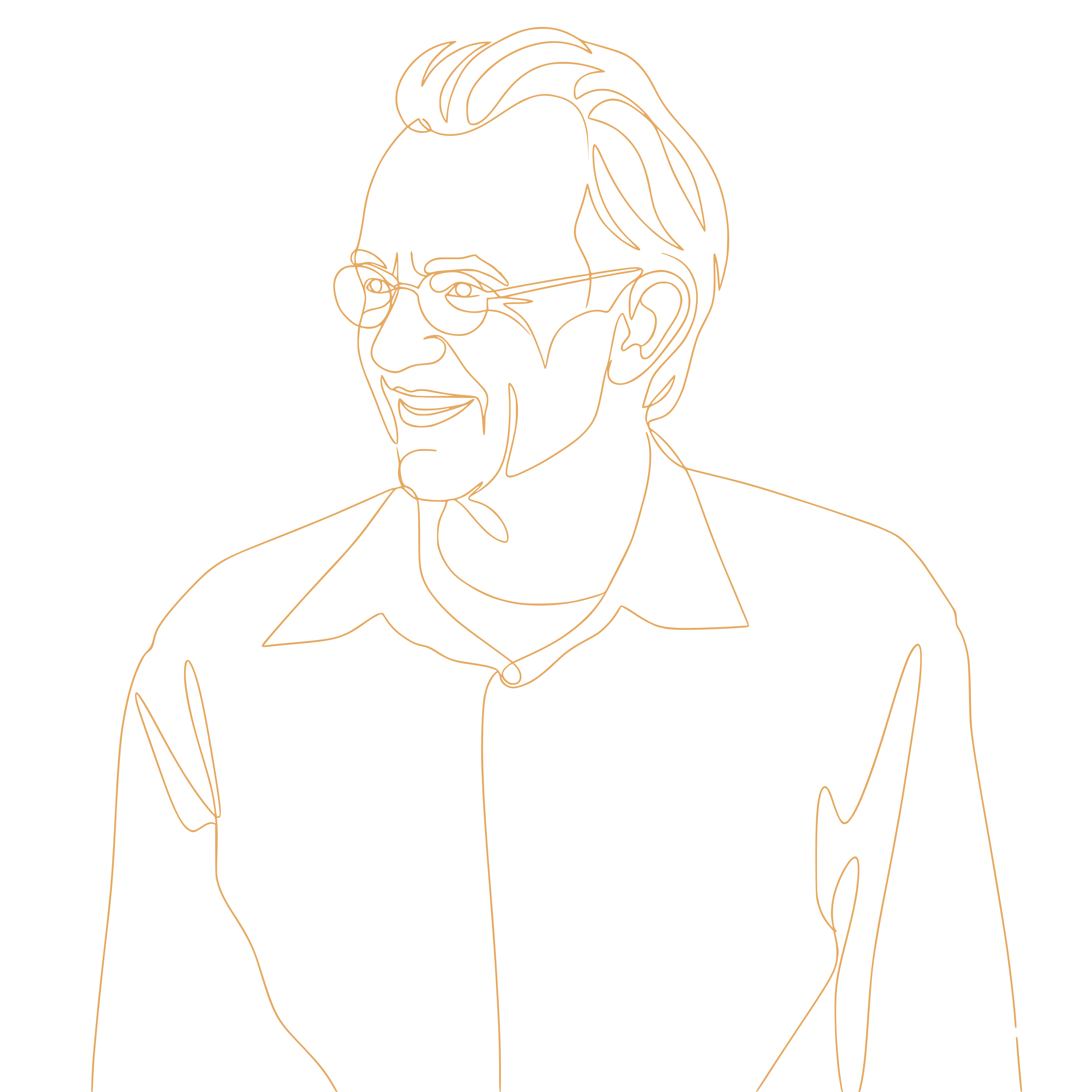
Edward Tufte, professor emeritus at Yale University, revolutionized data visualization and communication through works such as The Visual Display of Quantitative Information (1983), Envisioning Information (1990), and Visual Explanations (1997). His philosophy advocates graphical excellence, elimination of "chartjunk," seamless integration of evidence, and multifunctional elements that serve multiple purposes simultaneously.
Here, we apply these ideas to Markdown documents by maintaining a focused main column for primary content, placing supplementary material in margins or full-width sections, and ensuring every visual or structural element contributes meaningfully to understanding.
Key Tufte concepts appear throughout this guide: high data-ink ratio, careful layering of information, tight coupling of words and visuals, and a preference for small multiples over single, overloaded graphics.
Each category below includes not just syntax, but the reason the layout supports cognition.
Document Structure: Headings
Tuftean Rationale: Macro/Micro Readings
Headings provide a macro-structure that allows readers to understand the document's scope at a glance while navigating to specific micro-details.
This hierarchical layering prevents "flatland" (the lack of depth in information presentation) and establishes a clear path for cognitive processing.
In Tufte's terms, headings should function like a map legend: concise, stable, and informative. Keep the hierarchy shallow so the reader can scan without losing the narrative thread. Headings are not decoration; they are a high-level index to the evidence that follows.
Markdown Syntax
# Heading Level 1 (H1)
## Heading Level 2 (H2)
### Heading Level 3 (H3)
#### Heading Level 4 (H4)
Rendered Example
The page's title is its one H1 – it also becomes the page's <title> – so the example starts at H2.
Heading Level 2 (H2)
Heading Level 3 (H3)
Heading Level 4 (H4)
Limit depth to H1–H4 to avoid excessive nesting, which introduces unnecessary visual complexity. Do not skip a level: screen-reader users move through a page by its headings, and a jump from H2 to H4 reads as a missing section.
Text Formatting: Paragraphs, Breaks, and Emphasis
Tuftean Rationale: Minimalist Elegance and Signal-to-Noise Ratio
Tufte advocates for using the minimum amount of formatting necessary to convey meaning. Paragraph breaks provide structural "white space," which functions as a silent separator.
Bold and italic tools must be used strictly for "signal" enhancement; over-formatting creates visual noise that competes with the data.
Treat the paragraph as the primary unit of reasoning. Each paragraph should make one claim or advance one step, with emphasis used to clarify, not to decorate. If everything is emphasized, nothing is.
Markdown Syntax
This paragraph contains *italic*, **bold**, ***bold italic*** and ~~struck-through~~ text.

Another paragraph follows.

Line with hard break.
Next line after two spaces.
Rendered Example
This paragraph contains italic, bold, bold italic and struck-through text.
Another paragraph follows.
Line with hard break.
Next line after two spaces.
Use emphasis purposefully: bold for strong claims, italics for terms or nuance, strikethrough for a visible correction. Overuse diminishes impact and creates visual noise.
Line Breaks and Hyphenation
Text is set flush left and ragged right, as Tufte CSS sets it, and the build and the stylesheet keep the ragged edge even without the author doing anything. Words of six letters or more hyphenate at the line's end, with at least three letters on each side of the break and never more than two hyphens in a row; the browser weighs a paragraph's line breaks together, so no line is left much shorter than its neighbours. Headings, links and code are never hyphenated. A number stays on the line of its unit – 48 GB, 17.5 %, 250 ms – because the build turns the space between them into a no-break space.
Rendered Example
The Ethnos corpus currently holds 7,698,445 works and 7,786,681 publications, distilled from 22,678,823 fetched source records – 297 GB of cached responses – in a 48 GB database: a characteristically interdisciplinary, institutionally heterogeneous literature, reconstructed source by source.
Lists: Unordered, Ordered, and Nested
Tuftean Rationale: Parallelism and Comparison
Lists facilitate the comparison of discrete items within a single visual field. By organizing data into parallel structures, the reader can more easily identify patterns and relationships between variables, which is a core tenet of Tufte's analytical design.
Use lists when the reader benefits from scanning and comparing items side by side. Avoid long, decorative lists; in Tufte's view, each item should earn its place by adding evidence or a distinct concept.
Markdown Syntax
- Unordered item
- Another item
  - Nested level
    - Deeper level (use sparingly)

1. Ordered step
2. Next step
   1. Sub-step
   2. Another sub-step
Rendered Example
- Unordered item
- Another item
- Nested level
- Deeper level (use sparingly)
- Nested level
- Ordered step
- Next step
- Sub-step
- Another sub-step
Keep nesting shallow to preserve clarity and maintain high informational density.
Links and Images
Tuftean Rationale: Integration of Visual Evidence
Evidence should be placed exactly where it is needed.
Tufte argues that text and graphics should be "seamlessly integrated" so the eye does not have to jump across pages to find the relevant illustration.
Links serve as "micro-pathways" to deeper evidence without cluttering the primary narrative.
Images should carry information, not mood. A link is an invitation to verify or extend the claim. When you can, connect the claim directly to its evidence in the same visual neighborhood.
Links
Markdown Syntax
[Display text](https://example.com)

A bare address such as https://edwardtufte.github.io/tufte-css/ becomes a link by itself.
Rendered Example
A bare address such as https://edwardtufte.github.io/tufte-css/ becomes a link by itself.
Make the link text say where it leads. "PPGAS" or "Tufte CSS" can be read out of context – in a screen reader's list of links, for instance; "click here" cannot.
Contact Links
Write an address the way you would say it. The build publishes it obfuscated: the link's address is percent-encoded, and an address shown in the text is broken by a hidden decoy, so a harvester reading the page collects a mailbox that cannot receive mail. The link still works, the address still copies, and a screen reader still reads the real one. There is nothing to remember and nothing to encode by hand.
Markdown Syntax
[Mail](mailto:someone.nospam.@example.com)

Or simply someone.nospam.@example.com in a sentence.
Rendered Example
Mail – or simply someone.nospam.@example.com in a sentence. Both are safe to write; view the page source to see what a scraper gets instead.
Images
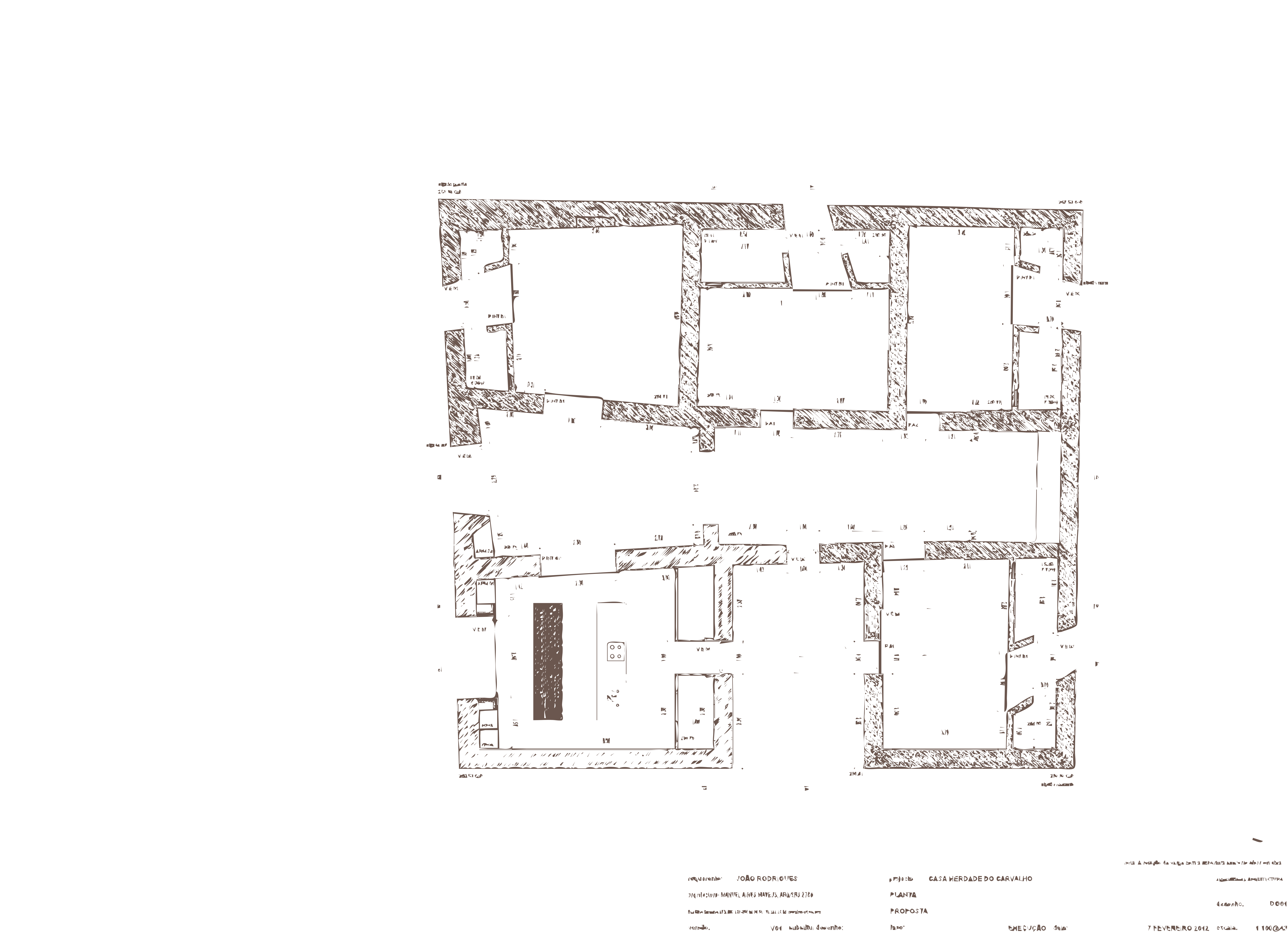
Images should provide substantive visual evidence, not decoration. The text in brackets is the image's alt text: what a screen reader says in its place, and what shows if it fails to load. Describe what the image shows, not that it is an image.
Place images adjacent to the paragraph that references them, so the reader can compare claim and evidence without scrolling.
Markdown Syntax
Rendered Example

Images live in content/img/ and are referenced as /static/img/…. In dark mode an image sits on the dark page as it is, so a drawing in dark ink on a transparent background, like the one above, fades there. To give dark mode its own version of an image, write it as a <picture>; the browser picks the source that matches the reader's setting:
<picture>
  <source srcset="/static/img/plan-dark.png" media="(prefers-color-scheme: dark)" />
  <img src="/static/img/plan.png" alt="Architectural survey drawing of a house plan" />
</picture>
Captioned Images
A title after the path becomes the image's caption, placed in the margin beside it. On a narrow screen the caption folds behind a ⊕ that opens it. An image alone in its paragraph becomes a figure; one inside a sentence stays in the line of text.
Markdown Syntax

Rendered Example
Blockquotes
Tuftean Rationale: Layering and Separation
Blockquotes provide a visual cue that information is being "borrowed" or emphasized from another source. This creates a secondary layer of information within the primary text, allowing for the inclusion of external authority without breaking the internal logic of the document.
Use blockquotes sparingly and keep them short. Tufte prefers that quotations sit close to the argument they support, with minimal typographic drama so the evidence, not the ornament, stands out.
Markdown Syntax
> Primary quote line.
> Continues across lines.
>
> - Can contain lists
> - Or other elements
Rendered Example
Primary quote line. Continues across lines.
- Can contain lists
- Or other elements
Pair blockquotes with a nearby comment or margin note that explains why the quoted material matters.
Epigraphs
An epigraph opens a chapter with a quotation set in italics and attributed underneath. Markdown inside an HTML block is not parsed, so the whole epigraph is written in HTML.
HTML Syntax
<div class="epigraph">
<blockquote>
<p>Above all else show the data.</p>
<footer>Edward Tufte, <cite>The Visual Display of Quantitative Information</cite></footer>
</blockquote>
</div>
Rendered Example
Above all else show the data.
Code: Inline and Blocks
Tuftean Rationale: Precision and Technical Literacy
For technical documentation, code is the "raw data." Tufte emphasizes the importance of showing exact data to allow the reader to verify conclusions.
Differentiating between inline commands and functional blocks maintains technical precision while preserving the flow of prose.
Treat code as evidence. Keep it readable, name the language after the opening fence, and prefer small, relevant snippets over long dumps unless the full context is essential to the claim.
Inline Code
Use backticks for technical terms or short commands.
Syntax
Run `npm run dev` to preview.
Rendered Example
Run npm run dev to preview.
Fenced Code Blocks
Preserve formatting exactly, line breaks and indentation included.
Syntax
To show a fence inside a fence, open the outer one with more backticks than the inner one uses:
```js
const message = "Hello, Markdown!";
console.log(message);
```
Rendered Example
const message = "Hello, Markdown!";
console.log(message);
A block whose longest line runs past about 76 characters is set full width by itself, taking in the margin, as the syntax example above shows. A line too long even for that scrolls inside its block rather than widening the page, and the block can be focused with Tab and scrolled with the arrow keys.
Mathematics
Tuftean Rationale: Exact Statement
An equation is the most compressed form of a quantitative claim. Typeset properly, it can be read and checked in place, instead of being paraphrased into prose that loses its precision.
Math is typeset with KaTeX at build time, so the page carries no script. A screen reader reads the equation from the MathML the build includes alongside it.
Markdown Syntax
Inline, as in $E = mc^2$, or on its own line:

$$
\bar{x} = \frac{1}{n} \sum_{i=1}^{n} x_i
$$
Rendered Example
Inline, as in , or on its own line:
Keep the dollar sign for math: in prose, write amounts as "USD 5" or escape the sign as \$.
Tables
Tuftean Rationale: High Data Density
Tables are often superior to graphics for small datasets. They allow for the presentation of precise numbers and categorical data in a compact format.
Tufte suggests that tables should be "rich in information but thin in ink," avoiding heavy borders that distract from the data itself.
Use tables when exact values matter. A clean table lets the reader compare without decoding an image. Keep the structure simple and align numbers and labels so patterns can be seen quickly.
Markdown Syntax
Colons in the separator row align a column, header included: :-- left (the default), :-: centre, --: right. Right-align numbers, so their digits line up.
| Feature      | Purpose             | Notes                       |
| :----------- | :------------------ | :-------------------------- |
| Headings     | Hierarchy           | Consistent levels           |
| Lists        | Organization        | Limit nesting depth         |
| Code Blocks  | Technical examples  | Use language identifiers    |
Rendered Example
| Feature | Purpose | Notes |
|---|---|---|
| Headings | Hierarchy | Consistent levels |
| Lists | Organization | Limit nesting depth |
| Code Blocks | Technical examples | Use language identifiers |
Align columns logically and keep entries brief. If a table needs interpretation, add a short sentence directly below it to guide the reader.
Every table is set on a panel one shade off the page, so it reads as one object apart from the text, with its rows divided by hairlines of the page colour. While the pointer is on a table, its header returns to the page colour, and so does the row under the pointer, so the eye follows the row across and reads each value against the heading that names it. Nothing else changes tone.
Table Width
A table's width follows from what it holds, counted in characters. If its widest row, unwrapped, fits the text column (about 72 characters of table type) or overruns it by no more than a fifth, the table stays in the column and a few cells wrap. A wider table is set full width, taking in the margin, so a long column of prose wraps into fewer, longer lines. Columns of numbers and short labels, up to 20 characters, are kept on one line, and the wrapping falls on the prose. The tables on this page are examples of both widths.
Tables Without Headers
Markdown requires a header row. Leave its cells empty and the table renders without one: an empty header row is dropped, and a single empty header cell among others, such as a corner cell, is published as an ordinary cell, since a header that says nothing labels nothing.
|                                                |      |
| ---------------------------------------------- | ---: |
| The Visual Display of Quantitative Information | 1983 |
| Envisioning Information                        | 1990 |
| Visual Explanations                            | 1997 |
| Beautiful Evidence                             | 2006 |
| The Visual Display of Quantitative Information | 1983 |
| Envisioning Information | 1990 |
| Visual Explanations | 1997 |
| Beautiful Evidence | 2006 |
On a narrow screen a table wider than the column scrolls sideways inside its own box, which Tab can reach, while the text around it keeps to the width of the screen.
Task Lists
Tuftean Rationale: Functional Elements
Task lists serve as multifunctional elements–they provide both information (what needs to be done) and a mechanism for status tracking (what has been done).
This dual-purpose design increases the utility of the document.
Use them to make progress visible without adding narrative clutter. The check mark is a compact signal with a high information value, consistent with Tufte's preference for efficiency.
Markdown Syntax
- [x] Completed task
- [ ] Pending task
Rendered Example
Each box is labelled by its item's text, so a screen reader announces "Completed task, checked". The boxes show state; the reader cannot tick them. Use task lists for process documentation, not for narrative sections.
Sidenotes and Footnotes
Tuftean Rationale: Parallel Information Streams
Sidenotes (and footnotes) allow for "side-streaming" of information. This enables the author to include necessary definitions, citations, or asides without interrupting the reader's primary focus on the main narrative.
Keep sidenotes brief and relevant. They are most effective when they clarify, cite, or add a small but useful detail. Long digressions belong in the main text or a separate section.
There are two ways to write one. An inline sidenote keeps the note where it applies; a footnote keeps a long note out of the sentence and can be defined anywhere in the file. Both render the same way: numbered, in the margin.
Markdown Syntax
Text with an inline sidenote.^[Written in place. It may carry *emphasis*, `code` or a [link](https://edwardtufte.github.io/tufte-css/).]

Text with a footnote.[^1]

[^1]: Defined anywhere in the file, and still shown in the margin.
Rendered Example
Text with an inline sidenote.Written in place. It may carry emphasis, code or a link.
Text with a footnote.Defined anywhere in the file, and still shown in the margin.
In this project, footnote syntax renders in the margin, so the reader never needs to jump to the bottom of the page. This keeps references close to the claim, which is a key Tufte principle. On a narrow screen the notes fold away; tap or tab to a note's number to open it.
Advanced Layout Patterns (Tufte-Inspired)
Tuftean Rationale: Multi-Window Viewing and High Resolution
These advanced patterns utilize the full available space of the digital canvas. Margin notes and image quilts allow the reader to view multiple pieces of information simultaneously, facilitating deep analytical comparisons that a standard single-column layout cannot support.
Use these patterns only when they improve comprehension. Tufte warns against empty decoration; each additional layout device should increase the clarity and density of information, not add noise.
Margin Notes
Place non-essential but helpful content (definitions, citations, asides) in the margin. Unlike a sidenote, a margin note carries no number.
They are best for short, factual additions that enrich the main paragraph without forcing the reader to detour. Only an emphasis or a link can become one.
Inline Syntax
A claim that needs a gloss. *The gloss sits in the margin, unnumbered.*{:.marginnote} The paragraph continues.

A source worth naming. [Tufte CSS, the stylesheet behind this site](https://edwardtufte.github.io/tufte-css/){:.marginnote}
Rendered Example
A claim that needs a gloss. The gloss sits in the margin, unnumbered. The paragraph continues.
A source worth naming. Tufte CSS, the stylesheet behind this site
Image Grids (Quilts)
Display related images for comparison or progression.
This is the digital equivalent of Tufte's small multiples: many small views of the same subject make patterns visible.
HTML Syntax
<div class="image-quilt fullwidth">
  <img src="/static/img/img-1.png" alt="Network 1 of 4: …" />
  <img src="/static/img/img-2.png" alt="Network 2 of 4: …" />
  <img src="/static/img/img-3.png" alt="Network 3 of 4: …" />
  <img src="/static/img/img-4.png" alt="Network 4 of 4: …" />
</div>
Rendered Example
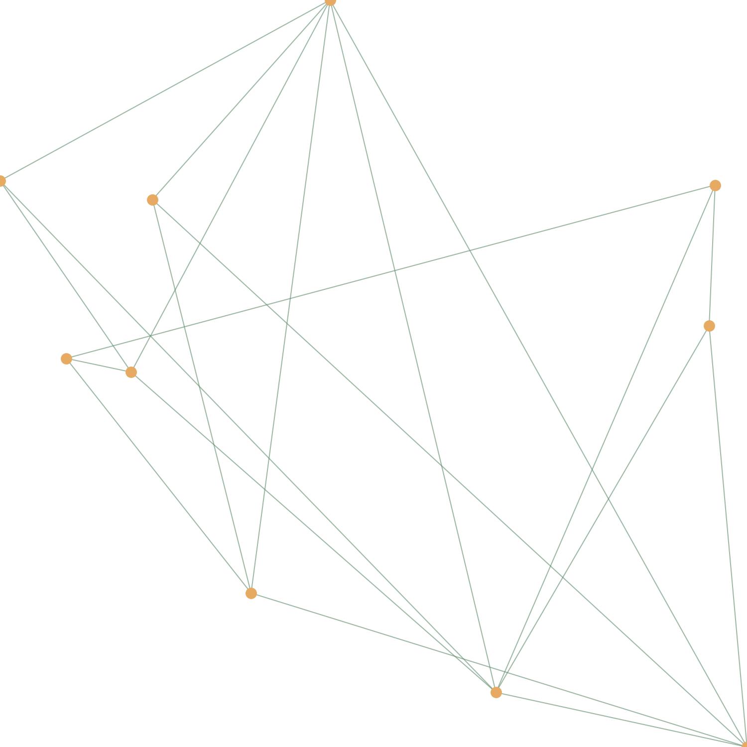
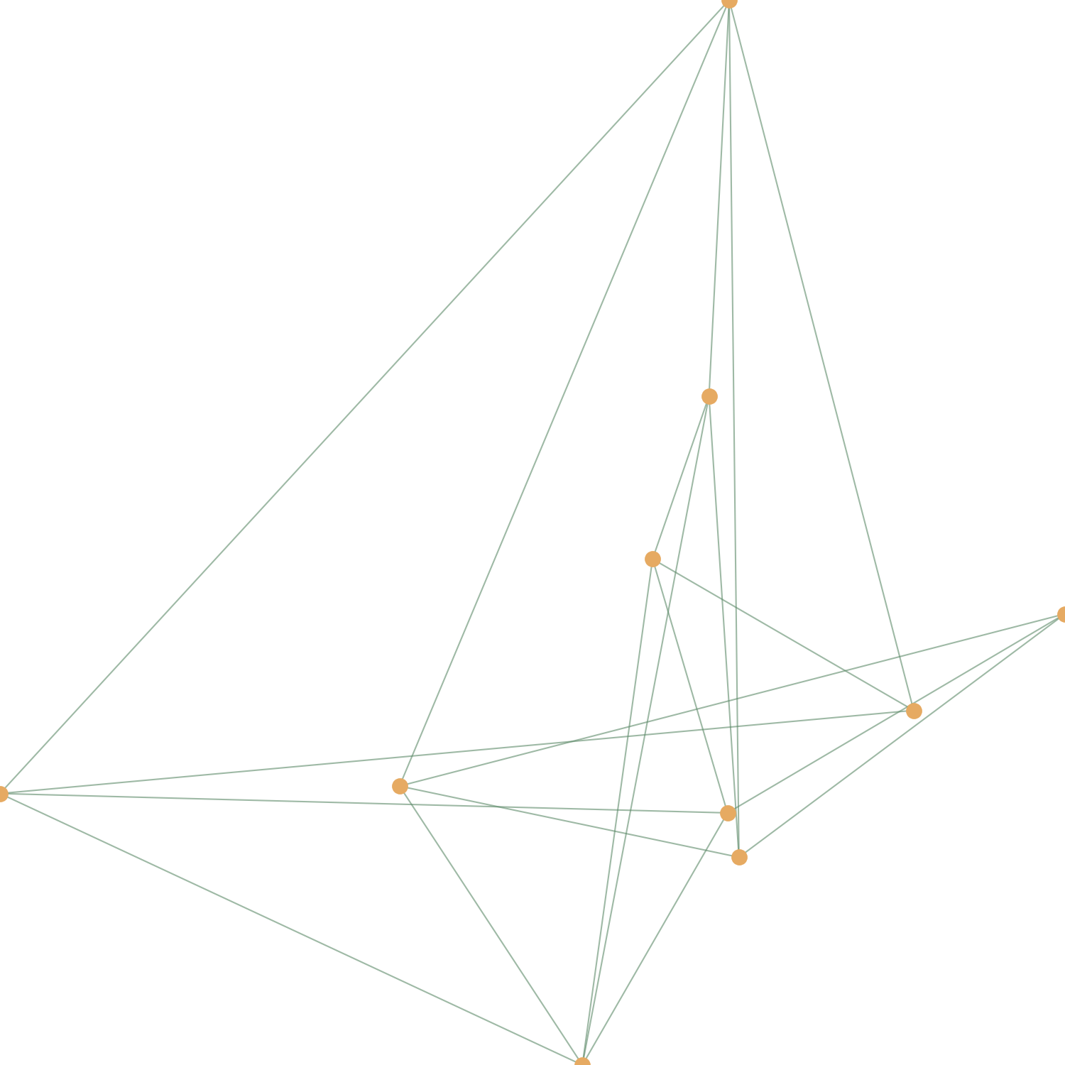
In a quilt, let the alt text say which view each image is and how it differs from the others; that difference is what the reader is meant to see.
Margin Figures with Toggle
Responsive margin images with toggle on small screens.
This keeps the margin behavior in a narrow viewport while still honoring Tufte's preference for side-by-side evidence. The drawing beside this paragraph is the rendered example.
HTML Syntax
<label for="fig-plan" class="margin-toggle">⊕</label>
<input type="checkbox" id="fig-plan" class="margin-toggle"/>
<span class="marginnote">
<img src="/static/img/imga.png" alt="Architectural survey drawing of a house plan."/>
</span>
The for of the label must match the id of the checkbox, and that id must be unique on the page: two toggles sharing one would both open the first note.
Full-Width Code Blocks
Preserve long lines or horizontal alignment.
Use full width when formatting or alignment is part of the meaning, such as columns or long commands.
HTML Syntax
<pre class="fullwidth"><code>
# Long code that benefits from extra width
import matplotlib.pyplot as plt
# ... extended code
</code></pre>
Rendered Example
import matplotlib.pyplot as plt
import numpy as np
import random
from itertools import combinations

def build_the_image(n_points, n_lines, points_color='#e6aa62', line_color='#5e8b6a', file_name="output.png"):

    coords = np.random.rand(n_points, 2)

    fig, ax = plt.subplots(figsize=(5, 5))

    fig.patch.set_facecolor('none')
    fig.patch.set_alpha(0)
    ax.set_facecolor('none')

    todas_possibilidades = list(combinations(range(n_points), 2))
    n_lines = min(n_lines, len(todas_possibilidades))
    conexoes = random.sample(todas_possibilidades, n_lines)

    for i, j in conexoes:
        p1, p2 = coords[i], coords[j]
        ax.plot([p1[0], p2[0]], [p1[1], p2[1]], color=line_color, linewidth=0.5, alpha=0.6)

    ax.scatter(coords[:, 0], coords[:, 1], color=points_color, s=20, zorder=3)

    ax.set_axis_off()
    plt.subplots_adjust(top=1, bottom=0, right=1, left=0, hspace=0, wspace=0)
    plt.margins(0, 0)

    plt.savefig(file_name, dpi=300, transparent=True, bbox_inches='tight', pad_inches=0)
    plt.close(fig)

build_the_image(n_points=20, n_lines=10, file_name="img-N.png")
Full-Width Tables
Accommodate wide datasets or many columns.
Full-width tables should remain light on rules and heavy on useful numbers. A Markdown table goes full width by itself when it needs to (see Table Width); class="fullwidth" sets it by hand on an HTML table. A <caption> goes first inside the table and is shown beneath it.
HTML Syntax
<table class="fullwidth">
  <caption>What the table shows.</caption>
  <thead><tr><th>Column 1</th><th>Column 2</th></tr></thead>
  <tbody><tr><td>…</td><td>…</td></tr></tbody>
</table>
Rendered Example
| Rank | Country | Projected Population (2025) | World Population % | Notes |
|---|---|---|---|---|
| 1 | India | 1.45 billion | 17.5% | Most populous; surpassed China in 2023 |
| 2 | China | 1.41 billion | 17.1% | Population peaking and beginning slow decline |
| 3 | United States | 347 million | 4.2% | Third place; growth driven by migration |
| 4 | Indonesia | 286 million | 3.5% | Largest Muslim-majority country by population |
| 5 | Pakistan | 251 million | 3.0% | Rapid growth; high fertility rate |
| 6 | Nigeria | 232 million | 2.8% | Fastest-growing in top 10; Africa leader |
| 7 | Brazil | 211 million | 2.6% | Largest in South America |
| 8 | Bangladesh | 176 million | 2.1% | Highest population density among large countries |
| 9 | Russia | 146 million | 1.8% | Largest by land area; declining population |
| 10 | Mexico | 134 million | 1.6% | Growth slowing; urbanization high |
Full-Width Figures
Allow large visuals to breathe.
Use these sparingly so that wide elements remain a clear signal of importance.
HTML Syntax
<figure class="fullwidth">
  <img src="/static/img/img-full.png" alt="What the image shows."/>
  <figcaption>Caption explaining the figure.</figcaption>
</figure>
Rendered Example

Newthought (Small Caps Lead-In)
Subtle typographic emphasis for paragraph openings.
It is a gentle cue that a new idea has begun, without the weight of a new heading.
HTML Syntax
<span class="newthought">Opening phrase</span> continues the paragraph.
Rendered Example
Opening phrase continues the paragraph, and the small capitals mark the turn without breaking the text with a heading.
Typographic Details
A few classes cover the smaller cases: a subtitle under a title, a sans-serif face for labels, old-style numerals that sit in running text, and a warning colour that keeps its contrast in light and dark mode alike.
HTML Syntax
<p class="subtitle">A subtitle, set in italics beneath the title</p>

<span class="sans">Sans-serif label</span>, <span class="numeral">1983, 1990, 1997</span> in old-style numerals, and <span class="danger">a warning</span>.
Rendered Example
A subtitle, set in italics beneath the title
Sans-serif label, 1983, 1990, 1997 in old-style numerals, and a warning.
Colour alone must not carry the meaning: say in words that something is a warning, as the text above does.
Horizontal Rules
Tuftean Rationale: Visual Separation
Horizontal rules act as clear, low-ink boundaries between distinct conceptual sections, signaling a transition without the need for verbose transitional text.
They are most useful between major shifts in topic, not between minor paragraphs.
Markdown Syntax
Three hyphens on a line of their own, with a blank line above: directly under a line of text, they would turn that line into a heading instead.
A paragraph before the rule.

---

A paragraph after it.
Rendered Example
A paragraph before the rule.
A paragraph after it.
Escaping Characters
Tuftean Rationale: Technical Integrity
The ability to escape characters ensures that the tool (Markdown) does not interfere with the data (syntax). This prevents ambiguity, ensuring the reader sees exactly what the author intended.
When precision matters, show the literal characters so the reader can reproduce the result without guesswork.
Markdown Syntax
\*escaped asterisks\* and \`backticks\`
Rendered Example
*escaped asterisks* and `backticks`
Inline HTML (Use Judiciously)
Tuftean Rationale: Extending the Toolkit
Standard Markdown is occasionally insufficient for high-resolution information display. Judicious use of HTML allows the author to introduce sophisticated elements like "details/summary" tags, which provide information "on demand," maintaining a clean primary interface.
Use HTML only when it improves clarity or structure. If HTML becomes the default, you lose the simplicity that makes Markdown readable. Markdown inside an HTML block is not parsed, so links there are written as <a href>.
Example: Expandable Section
<details>
  <summary>Click to expand</summary>
  <p>Additional content appears here.</p>
</details>
Rendered Example
Click to expand
Additional content appears here, opened by a click, a tap, or Enter once the summary has focus.
The site runs no scripts, and its security policy blocks content from other sites: an embedded video, map or web font will not load, while a linked image will.
Page Metadata (Frontmatter)
Tuftean Rationale: Nothing Twice
A page describes itself. Its title comes from its first # heading and its description from its first paragraph of prose, so a new file needs nothing else to appear correctly in search results and in link previews.
Add a frontmatter block at the very top of a file only to override what is derived. This page uses one, and its effect shows in the page's source, not on the page.
Syntax
---
title: "The md2tufte Possibilities: a Practical Guide"
description: A practical guide to the md2tufte Markdown syntax.
keywords: [md2tufte, Tufte CSS, Markdown]
image: /static/img/custom-card.png
imageAlt: What the card shows.
date: 2026-01-31
noindex: false
---
image and imageAlt replace the site's social card for this page; noindex: true keeps the page out of search engines and the sitemap.
Reading Modes and Accessibility
Tuftean Rationale: Respect for the Reader
The same evidence should reach every reader, whatever the screen, the colour scheme, or the way they move through a page. None of what follows needs to be written by hand; it is how every page renders.
- Light and dark. The page follows the reader's system setting. Every colour, including the highlight on a table row under the pointer, is chosen to keep text legible in both, at about the same contrast: dark text on white, and soft light text on a dark grey rather than white on black, which makes thin serif strokes glare.
- Measure. A line of text holds about 68 characters, however wide the screen; the space the page does not need for text goes to the margin, to full-width tables and figures, and to the sides.
- Narrow screens. Below 760 pixels, and when a reader zooms in far enough to reach that width, sidenotes and margin notes fold behind their number or ⊕, and wide tables and code scroll inside their own box.
- Keyboard. Tab reaches every link, every note toggle on a narrow screen, and every box that scrolls; a "Skip to content" link comes first.
- Screen readers. A note toggle is announced as "Sidenote" with its number, or as "Margin note". Math is read from MathML, and contact addresses read as written.
- Text size. Type is sized relative to the reader's browser setting, so a larger default enlarges the whole page.
The author's part is what no build can supply: alt text that says what an image shows, headings in order, link text that names its destination, and a unique id on each hand-written toggle.
Common Document Patterns
Tuftean Rationale: Structural Appropriateness
Matching the document pattern to the goal ensures that the layout supports the specific cognitive task–whether that is following a linear narrative (Essay) or performing a quick lookup (Reference Guide).
Choose the smallest structure that gets the job done. A good structure reduces searching and makes evidence easy to find.
- Essay: Title → Introduction → Sectioned body → Conclusion → References (use margins for citations).
- Reference Guide: Title → Headings-based TOC → Short topical sections → Code/table examples.
- Tutorial: Goal → Prerequisites → Numbered steps → Verification → Troubleshooting.
Writing Guidelines for Clarity
Tuftean Rationale: Principles of Analytical Design
Clarity is achieved by eliminating the "middleman" of complex prose. Active voice and direct lists reduce the cognitive distance between the reader and the information.
Aim for high data density with low visual noise. Every line should carry meaning, and every element should earn its space.
- Keep paragraphs concise for scannability.
- Favor active voice.
- Use lists and tables for structured data.
- Provide exact code in fenced blocks.
- Support claims with links or sidenotes.
- Ensure every element–text, code, image, or table–serves the reader's understanding.
Starter Template
Tuftean Rationale: Simplification of Workflow
A standardized template ensures that the principles of hierarchy and layering are applied consistently across all documents, allowing the author to focus on the data rather than the formatting.
Consistency is a form of respect for the reader: it creates predictable places for evidence, notes, and examples.
# Document Title

Brief introductory paragraph stating purpose.

## First Section

Core explanation with supporting examples.^[A short aside, in the margin.]

## Second Section

- Key point one
- Key point two[^source]

[^source]: Source or additional note.
This template incorporates headings, lists, and sidenotes while remaining extensible with Tufte-style classes for margins and full-width elements as needed. Saved as content/<name>.md, it is published at /<name>.